Dynamic and inviting storefronts attract customers and help to establish your brand’s unique identity. But when done wrong, storefront signs can dig your business into a hole, leaving bad impressions and signalling to potential customers to steer clear of your shop.
Signworld partners are all about creating stunning storefront signage. To that end, today’s post runs down 2 essential design considerations that our business clients use to help their storefront signs get results.
But this is more than a simple checklist that treats every sign need the same. We take a deeper look into the pros and cons of these 2 different design features, then discuss how to use this list to achieve your personal sign vision.
Read on to level-up your sign criteria and start your free design consultation off on the right foot.
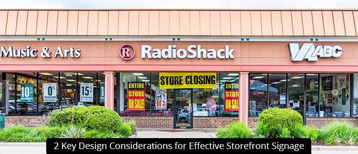
- Transparency versus privacy. Do you want people to see inside your store? For many owners, the answer is yes, since transparency allows pedestrians to glimpse exciting offers and new products from the sidewalk. This can greatly increase your conversion levels.However, not all businesses want transparent store frontage. For example, some gyms cater to clients who don’t want to be gawked at while they sweat and strain. For these businesses, transparent business frontage could actually hurt their sign-up numbers and make members feel uncomfortable.
If you do want transparency, focus on limiting your signage to no more than 10% of the total storefront glazing space. Avoid clutter, particularly when placing graphics on doors and windows, and design your store layout accordingly, with your products and promotions facing the sidewalk rather than putting their backs to it. Blade signs, channel letters, and other signage mounted above viewing level is a good idea.
If privacy is the goal, consider our selection of window wraps, banners, and murals to cover your frontage. You can also set up outward-facing indoor signs to block interior views and give your clients the privacy they desire.
- Inform versus intrigue. In some applications, it makes sense to put lots of information on signs. For example, a real estate sign will want to display a lot: the realtor’s name, phone number, email address, some details about their sales history or experience, a high-quality headshot, and perhaps the time and date of an upcoming showing. This sign is designed to give the reader all they need to book a consultation or visit the showing.However, most storefront signage should be designed to “intrigue” more than inform. While your storefront signs may “inform” the reader about big sales, new products, business hours, and brand name, they’re not meant to be salesmen. Instead, they’re meant to get people in the door, so that your salespeople can do the rest. The secret here is to offer enough information to catch the interest of a reader, but withhold enough to motivate them to take action, whether that means calling the number listed or stepping into your store.
Ultimately, you need to decide what works best for your business. And if “informing” is your goal, you need to be extra careful about over cluttering your design to the point where it scrambles the readers’ attention. Think about what you want and our designers will take it from there.
Start A Consultation With A Signworld Partner
Visit https://www.signworld.org to learn more about the Signworld business alliance and locate a partner near you.