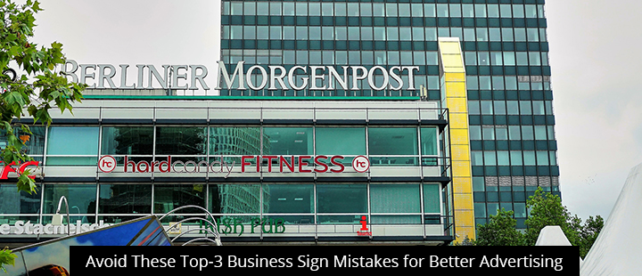
Today’s post shines a spotlight on the top-3 business sign mistakes that people make when trying to advertise their brands. Read on to learn how to avoid these costly errors and get the most out of your on-premise signage.
Location, Location, Location!
Obviously, you want to install your business sign in an area that makes your message impossible to miss. That means finding a spot that is visible from multiple angles and long distances. Ideally, try to mount it up high, since this will stop foot traffic from obstructing sightlines.
But there’s more to optimizing your business sign location than that.
It’s a good idea to choose a spot where your sign complements and contrasts nicely with the surrounding buildings or scenery. Standing out is important, but nobody wants to stick out like a sore thumb. If possible, try to pick colors and sign shapes that enhance the overall look of your local area, whether your business is located in a strip mall or tucked into your city’s downtown core.
Also make sure you assess your chosen area with all four seasons in mind. That spot you picked out might look perfect in the winter, but not so once the spring bloom hits and that tree outfront completely obstructs your sign! A simple oversight like that can effectively take your sign out of play for half of the year, costing you countless impressions and new customers.
Additionally, you’ll need to be sure that your chosen location doesn’t put you in violation of any municipal restrictions or zoning laws. Most cities have laws like these, but no two are alike, so make sure you do your research. If you need help, find a Signworld partner in your area–we’re experts in local zoning law that pertains to signage.
Over-Fancy Fonts
With so many fonts to choose from, it’s all too easy to be tempted into choosing something way fancier than you need. Not only does it look out-of-place with the rest of your brand materials, but it could also be stopping people from getting your message!
Like your logo, your fonts should be simple enough to be legible (or at least recognizable) if you squint your eyes and blur your vision. Remember: most viewers only see your sign for a few seconds, so stick with something classic and legible that they can take in at a glance. Nobody’s really that impressed by fonts–just get people in-store and let your products and services speak for themselves.
Business Signs Or Lettering Is Too Small
Make sure your business sign’s letter size suits your advertising goals. If you’re trying to engage people inside your store already, smaller letters won’t be a problem. But if you’re trying to reach people further away, follow these letter visibility guidelines (distance = size of letters in inches):
- 100 feet = 4 inches
- 250 feet = 10 inches
- 360 feet (one city block) = 16 inches
- 500 feet = 22 inches
- 750 feet = 33 inches
It’s also important to leave enough empty space to keep your message legible. Larger letters need more negative space, so make sure your business sign is big enough to give your message the long-range readability you want.
Get More Business Sign Tips From The Signworld Business Alliance
Visit the Signworld Business Alliance Website or call 888-765-7446 to locate a Signworld partner near you.