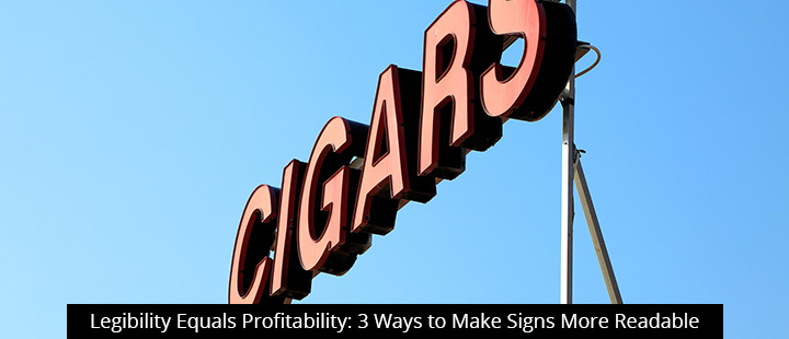
When it comes to signage, there is no profitability without legibility. Accordingly, today’s post shares 3 easy design tips to make your signage perform better for your business.
- Use negative space to your advantage. Of all the factors that impact legibility, negative space is among the most important. The term “negative space” refers to all of the empty space that surrounds the letters, words, messages, and images on your sign. If you’re ever tried to read an old newspaper or manual printing press publication, only to find that the letters seem to “bleed together” to the point where they’re illegible, you’ve had the displeasure of experiencing insufficient negative space.As a basic rule of thumb, know that greater negative space increases the odds of viewers distinguishing between individual characters and images, which translates to better readability. However, too much negative space can be problematic for comprehension, as the reader may struggle to distinguish between word and letter spacing.Striking the right balance is critical. If you need additional assistance determining how much negative space to use in your design, contact a Signworld partner near you.
- Find the perfect letter height. Letter height is another critical component of sign legibility. Too big and you’ll have no room for a meaningful message; too small and your customers will miss your message altogether.When advertising to foot traffic, manual testing is an easy and recommended option. Throw up some mock signage with letters at different heights, then take a brisk walk by. The sign should be unmissable, and the lettering should allow for reading at-a-glance (no squinting necessary!). Adjust as needed.Figuring out letter heights for roadside signs is trickier. The Federal Highway Administration (FHWA) has conducted extensive research on ideal letter height for signs to be legible to passing motorists. Reading height is measured with a simple formula–”time x speed”–with roughly 2” of letter height recommended for every 10 mph of speed. So if your business is trying to attract highway motorists, your letters need to be pretty big–4” minimum for a car going 25 miles per hour and 12” or more on the highway.
As always, Signworld partners can help you calculate the ideal letter height as needed!
- Steer clear of sans serif fonts. It has been known for decades that serif fonts are easier to read. However, sans serif typefaces are considered more modern and include a variety of widths and shapes that may not be available in serif. This style of typeface lacks strokes at the ends of letters (hence “sans” serif), which sometimes makes words run together.As a general rule, it’s best to steer clear of sans serif fonts to promote easy reading. However, modern design practices have made some sans serif option more viable. If your heart is set on something that serif fonts can’t deliver, get in touch with a Signworld expert.
Schedule A Professional Sign Design In Your Area
Ready to create a perfectly legible sign to generate leads for your business?
Visit https://www.signworld.org/go or call 888-765-7446 today to find a Signworld partner near you.
References
Berger, C. (2014). Typography, placemaking, and signs: A four-part SFI white paper series. Signage Foundation Inc. Retrieved from https://www.signresearch.org/wp-content/uploads/Typography-Placemaking-and-Signs.pdf