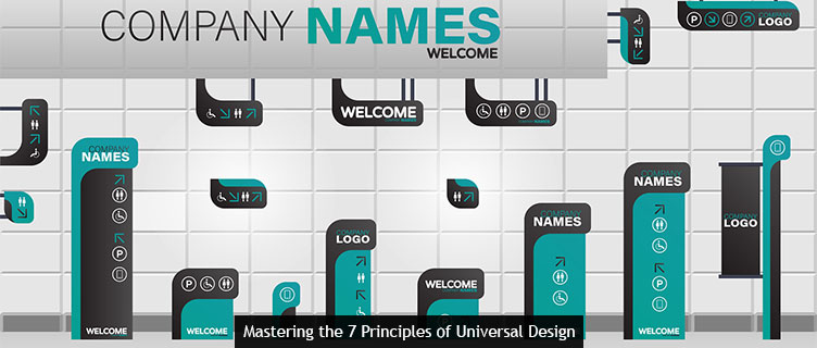
Today’s post reviews the 7 principles of universal design as they relate to signage. Read on to learn what modern consumers expect from your sign shop’s designs.
- Principle 1: Equitable use. Signs meet equitable use criteria when they are useful and marketable to people with diverse ability. This means that signage should be accessible to all, particularly those living with disabilities.ADA sign requirements exemplify the principle of equitable use. With approximately 2.5-million Americans confirmed legally blind, and many more living with limited vision due to macular degeneration and glaucoma, it’s critical that businesses invest in signage that is equally useful to the blind and able-sighted. Business owners who neglect to do so exclude a huge portion of the population. They also invite ethical problems and legal fees (first-time ADA violations can result in fines of $50,000 or more!).
Braille and raised text are two ways to promote equitable use, but it may be prudent to include instructions in different languages as well.
If you need help with ADA compliance and other components of equitable use, contact a member of the Signworld business alliance.
- Principle 2: Flexibility in use. Signs that meet standards for “flexibility in use” accommodate a wide range of individual preferences and abilities. Upholding this principle is great for the sign shop and business owner alike. For the client buying the sign, flexibility in use gets them more value for their money. And sign shops who offer these signs can leverage this value to increase product prices or achieve higher sales volume.
- Principle 3: Simple and intuitive use. Signs should be easy to understand, regardless of the reader’s experience, knowledge, reading time, or current concentration level. If your sign’s content requires more than than 2-3 seconds to take in, it’s either cluttered or confusing. Be merciless with your copy edits. Focus on brevity, and use visuals over text when possible–they’re easier to absorb at a glance.
- Principle 4: Perceptible information. Signs should be able to communicate important information to the reader at all times, regardless of ambient conditions or the individual’s sensory abilities.When it comes to sign design, Principle 4 boils down to your choice of color and font.
Avoid “serif” fonts, which include a slight projection finishing off a stroke of a letter in certain typefaces. These are not legible in some conditions, and tend to run together in low light conditions.
Font size matters, too. The most popular guideline for determining the proper sign and banner font size is to make them at least one inch (72 pt.) tall for every 10 feet of viewing distance.
Choose colors with strong contrast, too–dark font on a light background or vice versa. Reflective lettering is also a good idea for low-light conditions.
- Principle 5: Tolerance for error. Signs must minimize hazards and setbacks related to accidental or unintended actions.
- Principle 6: Low physical effort. Signs should be used efficiently and comfortably with a minimum of fatigue for the user. This may refer to eye strain caused by undersized fonts or craned necks caused by excessively high sign mounting.
- Principle 7: Size and space for approach and use. Every sign design and installation must provide appropriate size and space for approach, reach, manipulation and use, regardless of the individual’s body size, posture, or mobility.
Contact Signworld’s Sign Design Experts
Get more sign design tips “straight from the horse’s mouth” visiting https://signworld.org and locating a Signworld business partner near you.